I love stuff like this: .
It's shadow art, made from shaping random objects and projecting light onto it. My favorite are the slightly bent pieces of paper that have shadow-faces coming out of them.
Thursday, March 31, 2011
Tuesday, March 29, 2011
A Hateable Work from the Walker
 |
| Etching, aquatint on paper. 1987. |
Okay, it's this week now! This morning in OAD we discussed the merits of this piece as well as several others, with the Marina Abramovic piece generating the best debate vis-a-vis "Is It Art?"
I said much of this in class, but here it is in writing, for points, because that's how school works:
I find this Sol LeWitt piece , like many of Sol LeWitt's pieces, boring and ugly. It's just four triangles on a grey background, and there's little in the colors or the composition to capture or hold my interest. It's a blah piece, and if I'd seen it on its own on a museum wall I would have walked right past.
But I didn't see it alone. I saw it as part of the Walker's recent Sol LeWitt exhibition. I saw it in its proper place, as one of a series. Here are a couple more from that series:


And because I saw it in a series, and because I saw it in the context of Sol LeWitt's larger body of work, I saw it as art. I see it as art. This assignment was an excellent reminder of how important context is in determining what art is, and what art is not. These pieces, with their repetition and their reliance on simple forms, fit so well into the artist's oeuvre. His work, as some random Wikipedia person put it, "is not about the singular hand of the artist; it is the ideas behind the works that surpass each work itself." Of course, it is easy for the ideas to surpass the work when the work is as ugly as this one. (Some of the other pyramids, like the ones above, incorporate a more attractive color scheme; the one with the yellow background is my favorite. We must also remember that these pieces are from the eighties, when some of these colors were a little more au courant than they are today.)
One of the main failures of this piece, in my opinion, is that the idea behind the work is not particularly apparent. Is this a color study? A shape study? I'm not sure what Sol LeWitt was aiming at when he made these pyramids. There was a Sol LeWitt quote on one of the walls at the Walker. I didn't write it down, but it went something like this: "It is meaningless. That is art."
Sometimes, I guess meaningless is enough to satisfy me, so long as there's lots of meaningless stuff on display, an entire life's work worth of meaningless stuff.
we're going to watch.............................
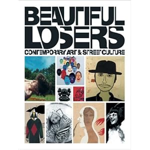
We;re going to watch the film "Beautiful Loosers"
Making you watch "Helvetica", or talking about what is the magic that makes art art......... I felt guilty, wrong, I think it's better to be inspired - inspired by doing.
Bring coloring tools:
drawing, etc...
use your visual notebook, make art while we watch this.
I feel this is more where "ART" is going... something honest and simple. Some place between graphics & art - film, photo, fashion..... good times

the work of:
Margret Kilgallen

Barry McGee

Thomas Cambell

Jo Jackson

Shepard Fairey

Chris Johnson
Geoff Mcfetridge


Mike Mills

Harmony Korine

Stephen Powers

Ed Templeton

....... and more
Making you watch "Helvetica", or talking about what is the magic that makes art art......... I felt guilty, wrong, I think it's better to be inspired - inspired by doing.
Bring coloring tools:
drawing, etc...
use your visual notebook, make art while we watch this.
I feel this is more where "ART" is going... something honest and simple. Some place between graphics & art - film, photo, fashion..... good times
the work of:
Margret Kilgallen
Barry McGee
Thomas Cambell
Jo Jackson
Shepard Fairey
Chris Johnson
Geoff Mcfetridge
Mike Mills
Harmony Korine
Stephen Powers
Ed Templeton
....... and more
Saturday, March 26, 2011
Massimo Vignelli Design Lecture
His philosophy: “We like design to be visually powerful, intellectually elegant, and above all timeless.”
Thursday, March 24, 2011
A cell phone made to last

"What it lacks in features, it makes up for in quality, from the gold and steel metalwork by luxury-watch craftspeople to custom ringtones by the Danish-Vietnamese musician Chris Minh Doky. The flourishes include real metal screws rather than glue, a ceramic body (like you might find a Rado watch), individually articulated buttons, and a screen made not of plastic or glass, but rather crystal sapphire, polished and coated much like a camera lens."
Read all about it here.
Wednesday, March 23, 2011
Irina Werning

http://irinawerning.com/back-to-the-fut/back-to-the-future/
Definitely check this photographer out. I came upon this randomly and am really jealous I didn't think of this first. GENIUS.
Tuesday, March 22, 2011

Visual Information (mapping)
what do we need to know???
What are you comparing it to???
How do you want me to feel????
• Images
• color
• size
• texture!!!
• ---> Aesthetics is your arsenal
How much information can you give me in an instant?
Data = information = Visual = ACTION
take out the words = make them visual
What are you comparing it to???
How do you want me to feel????
• Images
• color
• size
• texture!!!
• ---> Aesthetics is your arsenal
How much information can you give me in an instant?
Data = information = Visual = ACTION
take out the words = make them visual

Monday, March 21, 2011
Inspiring Art (Mostly from Santa Fe, NM)


Uta Barth, Photographer. All via Google.

Jim Jennings, Oil Painting. Via johnbstrong.com


Karen Gunderson, Black Oil on Linen Reflecting Light. Via karengunderson.com, Google.
See williamsiegal.com


Erin Cone, Acrylic. Via erincone.com, nuartgallery.com


Valerio D’Ospina, Oil Paintings. Via evdospina.com, skotiagallery.com
Morigami Jin, Bamboo Weaving. Via Google. See textilearts.com

Margret Nes, Pastel. Via Google. See margretnes.com


Tuesday, March 8, 2011


Walking Around CVA


These images represent many of the things I try to infuse in my design Aesthetic. In the first photograph I took a picture of the linear panels which make-up a window. Furthermore, this is an object which is not traditionally looked at as a source of inspiration, and this happens to be a concept I strive to infuse in my art and life. As well as this, I am always looking to architectural objects as inspiration, hence the image of the blurred architectural structure in the background. The second photograph represents my love of light and the way it reflects against objects. The third photograph represents my love of circular shapes and essentially things which feel organic but yet are mixed with organic things, such as a light fixture.
My design Aesthetic
My design aesthetic can be described as infusing contradictory elements such as elements of masculinity and feminine aspects of design. This also might imply that my design aesthetic is not entirely confined to a singular vision; however I do not mind this because I can also be a contradictory person. One minute I might feel like imitating men’s clothing or another day I might be inspired by Marie Antoinette and her attire. I can be political while intending to be in an industry which is based on vanity. I also try to infuse culture, be it African or Iranian, into my design aesthetic. Here are a few images which I feel represent my design aesthetic.


Achitecturally inspired peices & Menswear inspired peices

photographs of nature, although i hate venturing into the wild.


Culturally Ornate peices Vrs. Minimalism
Images Courtesy of: Atelier Versace, Preen, Me, Givenchy Haute Couture and Alexander Wang
Images Courtesy of: Atelier Versace, Preen, Me, Givenchy Haute Couture and Alexander Wang
Subscribe to:
Comments (Atom)