Class blog for Orientation to Art and Design, Part of the College of Visual Arts' Freshman Foundation program. Instructed by Abbi Allan
Monday, January 31, 2011
Jeremy Scott
Check out Jeremy Scott Spring/ Summer 2011 here http://www.jeremyscott.com/livestream.html
Wednesday, January 26, 2011
Folding chairs everywhere

Fabien Barral is a designer from Clermont-Ferrand, France who has been creating functional works of art for clients since 1997. Living in a cottage in the country has caused him to do most of his work remotely. Fabien’s techniques implement rich textures, bold contrast, and washes of color to bring each piece to life. Clean, modern lines layered with elegant, vintage textures combine to create an air of timelessness. While his work maintains a common feel, the breadth of his portfolio spans from minimalist to ornate and from organic to technical. He demonstrates an extensive understanding of typography by combining serif, san-serif, and script faces and by utilizing old-style numerals and unicase figures in much of his work. Fabien’s more recent work has included letterpress printing of calendars, coasters, and business cards. He explains his passion for the visual arts by saying, “I am what I create, I create what I am.”
Sources:
http://www.abduzeedo.com/inspiration-fabien-barral
http://www.behance.net/imoments
http://www.thegraphicdesignschool.com/blog/whos-who/interview-with-fabien-barral/
http://www.graphic-exchange.com/
Tuesday, January 25, 2011
Steve Mumford is braver than you
Mumford is an artist who has spent several months embedded in Iraq with U.S. troops. He's an embedded artist, which is a lot like an embedded journalist, except instead of taking photos, writing about, or broadcasting the war, Mumford draws and paints it.
Evidently, there's a long tradition of artists who've done this sort of thing. But I haven't really seen anything like Mumford's work come out of the Iraq war, and it struck me as such a wonderful and peculiar form of journalism. After all, we have photography. It's cheap and instantaneous and (somewhat) objective. If you want to capture a moment as it really was, you snap a picture. But there's something about the slow, considered deliberateness of using pencil and ink and paint to record these moments in war-torn time that really affects me, both as an artist and as a citizen of a country that has been pointlessly and continuously at war for nearly a decade.
I guess Mumford has collected his war art in a new book. I'm going to read it. I'll let you know how it is.
Chuck U...?


Maya Hayuk and why I love her!
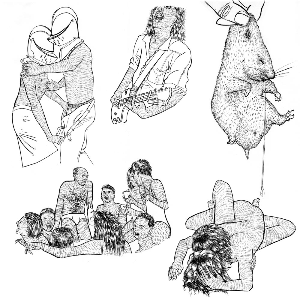
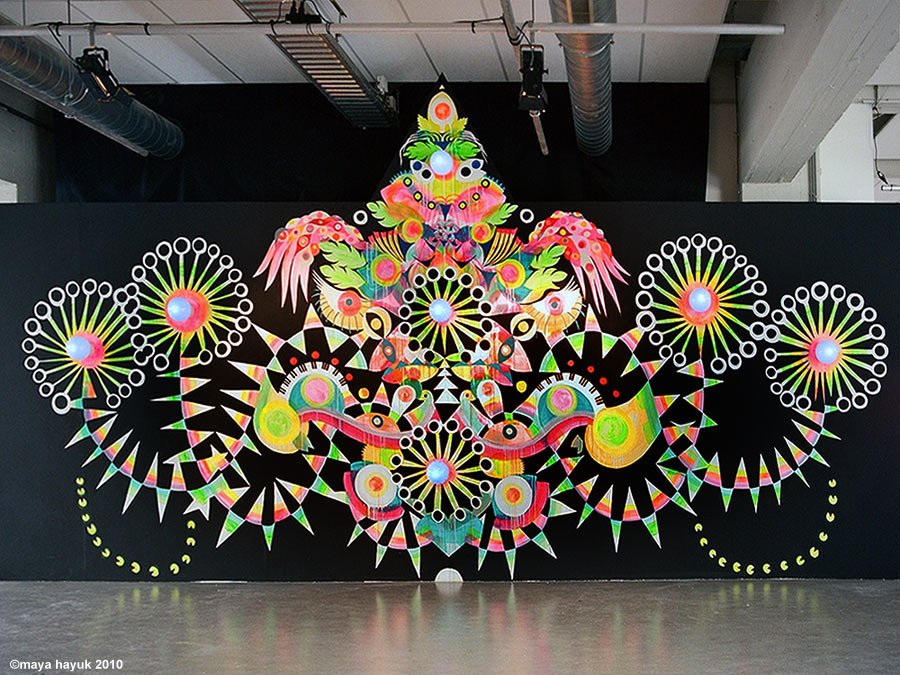
When I first came across Maya Hayuk, I was sixteen and in love with markers. Maya is an artist that uses incredibly vibrant colors and geometric patterns to evoke good vibes. She even came out with a book titled Just Good Vibes. That's probably why I was so attracted to her at first. She is a muralist, painter, drawer, photographer, and printmaker, and musician. She does independent studio work as well as many collaborations with other artist groups or artists. I think her work is important because it makes me happy and makes me inspired to make murals. I'm obsessed with lines, and a lot of her murals play with lines and overlapping them with color. Her drawings also fascinated me. A certain series especially shows couples in multiple "love" positions. Its beautiful because the faces are completely covered by long flowing detailed shiny looking hair. There's a magical feeling to her work and an innocence. It doesn't feel too serious or pretentious. It's familiar but still different. And I love it.
Ryan Trecartin for W Magazine


David Hale Review

I discovered Rachel Timmins because she and I look oddly alike.
Aside from that, she does amazing work. She's an MFA candidate at Towson University, focusing on Studio Art mostly concerning metals, jewelry, sculpture and the like. This necklace that she is wearing is an original piece. I partly love it because of the message that she tries to communicate in her work: the feeling of homelessness. And this isn't homelessness in the way of not having a place to live, but more so in the way of not belonging and feeling alienated. I can identify with this, especially because we both share an affinity for body modifications which often contribute to a feeling of alienation because they are not widely accepted. To convey this message, she makes restrictive or uncomfortable jewelry that limits the wearer's mobility. She also does sculpture, and her sculptures play off of her message through narrative to show the viewer about alienation rather than putting them directly in a situation. But these sculptures are small and intimate and still place the reader in an interactive position, whether they are wearing it or simply observing.
So here is my question: Does she make this work in the hopes that people will identify with it, or does she make it to make them identify with it? Does she want to force people into her position, or does she want to find people already in her position? Does she want to alienate herself further through her work, or is this a search for a “home”?
her portfolio can be found at: racheltimmins.com
1) Spelling and Grammar still count (*I know... booo).
I usually like to write things out in a word doc. and then cut and past them over into the blog.
Why? Because I can't spell, and grammar - it is beyond me - BUT - you are required to do it well. How will I know then if you are miss-spelling anything? Simple my dears.... cut and paste right back into word and there you go. Can't hide from it, just do it.
3) Site and source EVERYTHING! It's very important and for legal reasons even. Also, it can be a great resource for someone else who is researching a similar artist to keep clicking their way into the infinite source of possibilities found on the web. Get link happy - highlight the words you want to link to the original site, then hit the blue button above that says LINK, and then paste in the original web site.
So let's say I was supposed to write about an art I made this summer (good times).
I would paste my image to the screen via that little button up above that has a picture of a mountain on it.
What you need for your visual Journals - (*An example)
Posted on the site: http://creativecriticalthinking.blogspot.com/2010/04/visual-journaling.html

she recommends the sites / books:
samples from that web site:

http://mcturgeon.com/blog/2008/09/07/1000-artist-journal-pages/

http://www.coastcollective.ca/classes.html

http://ramblingrose.typepad.com/journal/2008/04/microscope-slid.html
 http://ict4entrepreneurship.com/category/ethnography/
 image taken from: http://jewelryartistjournal.com/visual-journal-7tips/
 on this site she gives her own advice for how she gets her ideas and uses this book
"Tip #3 Find things you love to put in there! Inspiration can come from anything and anywhere, snapshots taken when going for a walk, at the beach or in the park, or just walking down the street. It is easier than ever to take snaps, just using your mobile phone, no problem if you forgot to take your camera, just a quick shot with your cell phone will remind you of what you found so you can work it out further when you get back home." - - - Maggie Bergman
here's an example of someone who does this:
http://www.fastcompany.com/blog/linda-tischler/design-times/introducing-guest-blogger-ken-carbone-curiously-curious-kind-guy
Here's another one - ignore the cheesy dopes from "studio 5" - but the man being interviewed, David Clyde - is actually very smart! Just listen to him. He uses a visual journal for design
the video is not copying - but you can find it here: http://studio5.ksl.com/?nid=58&sid=12038431
I took this DIRECTLY FROM - CUT AND PASTE - THIS INFORMATION IS NOT MY OWN BUT THAT OF STUDIO 5. I TOOK THIS FROM: http://studio5.ksl.com/?nid=58&sid=12038431
Most people know what they don't like, few people know what they do like and even fewer know why. Here are my steps for exploring, discovering, distilling and building upon your own unique sense of style and design:
1. Start a Design Journal
Start by getting a note book or an art pad and designating it as your design journal. A design journal is a working record that serves to help you discover and understand your own personal design style. A design journal is an ongoing dialog with yourself and a resource you can continually add to and draw from. [Visual Support - Physical example of a working design journal]
2. Open yourself to inspiration.
To be inspired we have to expose ourselves to new things and experience what the world has to offer and recognize the way these things make us feel. Look for inspiration beyond your next door neighbor's house. A great place to start is by looking through design magazines, websites, blogs etc. discover things you have never seen before; examine them for things that speak to you in some way. Don't limit yourself to brand specific catalogs as they are only a big advertisement from one point of view. I like to go through design magazines and websites that feature a variety of work from different designers and artists as they pull from many sources and life perspectives to create spaces that are unique and fresh.
Here are few magazines that I like and are easy to find:
• Architectural Digest
• Veranda
• Interiors
3. Seek Visual Inspiration
Clip or print the pictures and put them in your journal and jot next to them what is you like it may be a particular color combination, pattern, feeling you get or memory it evokes. Whatever it is it is personal to you and is key to identifying your style. If you like something but are not quite sure why still include it and come back to it later these are the fun mysteries we get to discover about ourselves and helps define our deeper sense of style.
4. See the unusual in usual things.
Don't limit yourself strictly to design specific sources There are new beautiful things to discover everyday. Look at the everyday things around you with new eyes and ask new questions about old things, like what else could I use this for? If I arraigned these differently what would they look like? You will find that a simple change of perspective will create a new view of the world.
5. Generate and capture new ideas.
Once you start to understand why you find different things beautiful or inspiring you will naturally apply this knowledge to your own personal sense of being and begin to generate new ideas that are unique to only you. Write them down or draw them simply in your journal or snap a quick picture to preserve the process and look for ways to apply them to your life.
6. Break things up.
After a while your journal will begin to fill up with inspirations and your own ideas you now have the ability to sort and categorize these things in any way you want. You can break it up into rooms, colors, moods, shapes etc.
Now that you have a foundation . . .
Once you have begun to understand what it is you like and why you now have a solid foundation for building on basic design principles to influence the spaces around you improve the way you want to feel and how you want to live.
It is David's belief that each project is an opportunity to provide a better result than his last project. With the experience and ability to design a space from the ground up there is no shortage of opportunity to become better and create something new every day.

www.davidclydedesign.com
Phone: 801-232-5653
or visit him at:
Ethan Allen
10390 S. State Street
Sandy, Utah 84070"


